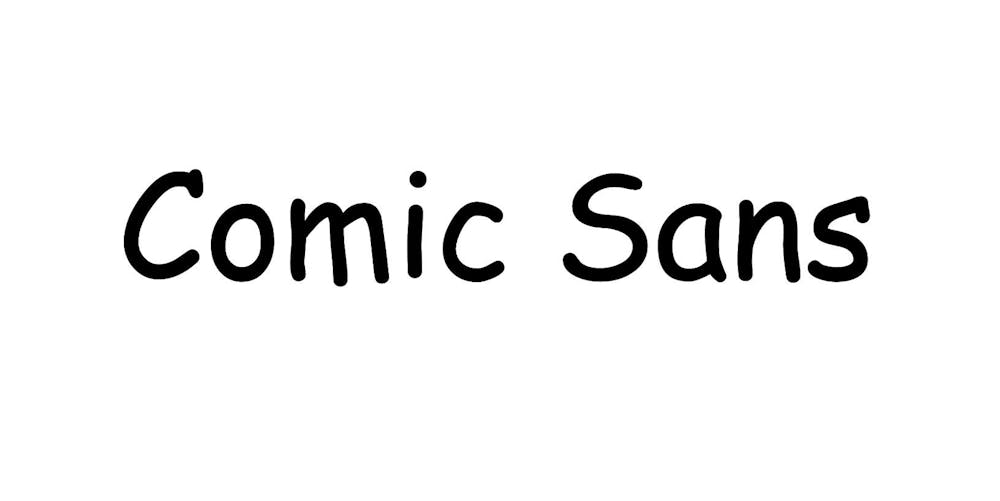
Comic Sans —well known for being a controversial and often misused font. These cartoonish letters generate division on whatever Google or Word Doc they appear. But are there any grounds to such widespread abhorrence of Comic Sans?
No, no there are not.
Before one can critique Comic Sans based upon its child-like, jovial appearance or vast misuse, it is necessary to dive into the rich history of how this divisive font came to be.
According to The Atlantic, Comic Sans came into being in 1994, when Microsoft typographic engineer Vincent Connare designed it for the program Microsoft Bob. From its inception, the font was intended to bring levity and humor to internet users as they explored various programs.
“It was never meant to be something that would be widespread and used all over the place,” Jonathan Bouw, Professor of Art, said. “It was to be an informal, playful, comic thing to be used in Microsoft Word and other applications.”
So why all the hatred from a worldwide audience? How could a font that has brought forth millions of memes have gone so wrong?
There is a reason.
Comic Sans is not the best available font, nor is it suitable for all situations that require typefaces. Its appearance on the page, if used in improper context, can look out of place or even silly.
“As far as any kind of serious graphic design, it’s kind of a joke, and it’s really not good typography,” Gary Varvel, American editorial cartoonist, said. “It should only be used in irony.”
However, people do not make the conscious choice to use Comic Sans ironically.
Nor do they stop to consider that the font they select from a drop down menu on their computer could have vast, unintended consequences.
“The reason I think a lot of people don’t like it (Comic Sans) is they think it’s been overused by a lot of people for the wrong context,” Landin Brown, assistant professor of art, said “You’ll hear stories about it being used upon tombstones or epitaphs, these crazy kinds of scenarios.”
When anything– typeface or otherwise– is taken out of its proper context, it is easy for it to become misunderstood. Especially when that typeface’s appearance is a bit, well, ridiculous.
Such is the tragic fate of Comic Sans.
The question is, then, whether it can be redeemed.
Brown is optimistic in this regard.
“We need to educate people on the fact that it’s not necessarily a bad font, we’re just not using it for the right purposes or settings,” Brown said. “For me, it comes down to the personality you’re trying to convey with your typographic choices.”
While context must be considered when using something like Comic Sans, it is also essential to remember that artistic beauty does not have to be isolated to one form, facet or font.
Sometimes things seeming to be ridiculous or “out there” have a unique capacity to be lovely if used correctly.
And if that is the case, then maybe Comic Sans is not a complete waste of time after all.
“If something is beautiful, it becomes more memorable and it becomes more easy to retain, so we remember it better,” Bouw said. “We forget things that are ugly and dull because our brain doesn’t want to remember them.”
Perhaps Comic Sans is exactly the kind of spontaneous, unusual expression of art that’s been missing from society. Perhaps, even if it should not be used on gravestones or memorials, it is not the worst font in the world.
It could very well be a form of playful innovation that has been grossly underestimated; and may now, at last, step from the shadows into the light.


