Hanson Reed | Echo
I will be the first to admit I'm usually behind the times when it comes to adopting the latest technological trends. My household didn't have a working computer for much of my childhood, and my mother had a Facebook account long before I did. Google held no place in my life until high school, and my television has cathode ray tubes. I'm not a Luddite. I find technology fascinating and have followed its progress with excitement most of my life. I just take my sweet time actually adopting it for my own use.
My old cell phone lasted four years and died a slow, agonizing death. Although I had little urge to get a smartphone, I was frustrated by the declining quality of traditional cell phones. By pure stubbornness, I was able to keep my old phone on life support until the release of the iPhone 5, thus beginning my brief stint on the cutting edge of technology. It's been fun.
As many of you are likely aware, Apple released the latest version of its mobile operating system Sept. 18, prompting iPhone users to download the update en mass. I would not presume to give you my opinion of the software, as I have yet to personally use it. According to the descriptions I have read over the past few weeks, Apple has made some interesting and useful improvements, and feedback seems to be positive thus far. However, I am hesitant to download it.
I'm not so worried about the minor glitches expected at the launch of any software. Apple will work these out in short order, and it's unlikely I would even notice them. No, my hangup is purely aesthetic.
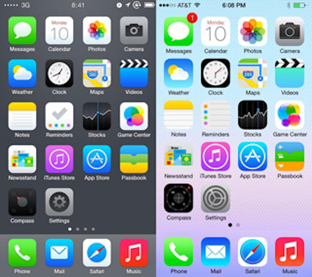
The new operating system is merely the latest and greatest example of a trend that has been growing for awhile: the elimination of skeuomorphisms from user interfaces. Skeuomorphism is a term used to describe graphical elements of interface design that reference real world counterparts. Examples include a virtual calculator with buttons that look like they belong on, well, a calculator, or a way to leave reminders in the form of digital sticky notes. Apple has long been associated with such designs, thanks in large part to Steve Jobs' leadership - but things are changing.
Jony Ive took over the development of iOS last fall, and the result is what many purists have been asking for: the death of skeuomorphism, at least on their mobile platform. Many view the concept that the digital world should visually reference the real world as clunky and outdated. They favor a flat, simplified mode of design. Gone are the days when your virtual notepad looked like a yellow legal pad and your virtual calendar looked like a classic spiral bound. Gone are the highlights and shadows that seem to make buttons and icons bulge off the screen.
It's a brave new world.
I'm not here to bash the new operating system. I'm quite sure it is the innovative step forward we would expect. I am not even trying to single out Apple. Other softwares have been moving this direction for quite some time. Apple merely produced some of the most iconic (pun intended) examples of skeuomorphisms, and held out longer as developers, including Microsoft and Google, embraced a flat design concept.
Maybe the new way of things really is better and simpler. I'm not a software designer. I just know I like how everything on my iPhone seems to pop off the screen. I like how the apps look like real-world tools. To me, it's appealing, comfortable and beautiful.
I'm sure I will assimilate into the new environment in time. I will become attached to its bits of genius and artistic flourish. I will type into a simple text file, remembering fondly the old times when I would jot down ideas in script font on a digital legal pad.


